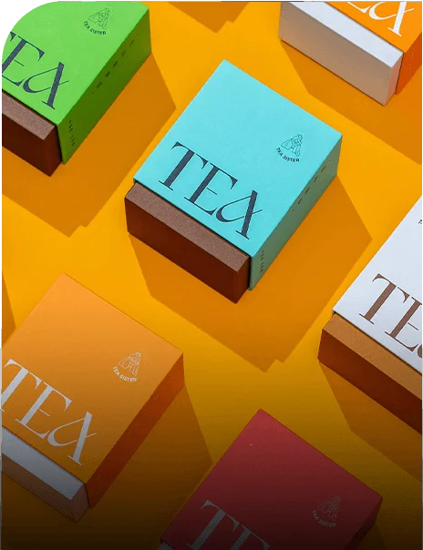






































































Custom packaging branding is a set of rules that keeps a product recognizable when the package changes. A dieline is the flat cutting template a printer uses to print, cut, score, and fold the package. A digital proof is the screen review of that dieline before printing. A useful guide covers the mark, product name, type, color roles, images, panel order, and surface treatment, then shows where those rules bend around folds, seams, glue tabs, closures, and windows.
What should a packaging brand guide control?
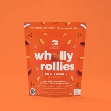
The fixed rules belong in one master page, while product-specific notes sit beside them. Set the logo position, product-name hierarchy, type scale, color roles, image treatment, information order, and areas that should stay quiet. Then label each rule as fixed or flexible. A tin may need a compact layout, while a carton may provide more panels. A mailer may need the mark on the outside before the recipient opens it.
- Keep logo placement consistent where the structure gives you a usable panel.
- Set a reading order for the product name, variant, and supporting copy.
- Record color roles, type choices, image treatment, and finish limits.
- Mark folds, scores, seams, glue tabs, windows, and closure areas before artwork starts.
- Show how the system changes for each package format.
Which material gives a brand system a stable starting point?
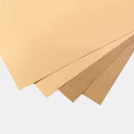
SBS means solid bleached sulfate paperboard. C1S has a coated face, while C2S has coated faces on both sides. Kraft board keeps more of its natural paper appearance. Rigid chipboard is a stiff board wrapped in printed art paper, so it holds its shape instead of folding like carton board. The ranges below are typical industry references and should be matched to the chosen structure.
| Material or finish | Typical industry reference | Practical branding check |
|---|---|---|
| Folding carton board | SBS, C1S, or C2S, 12 to 24 pt | Printed panels, stiffness, and fold behavior |
| Kraft board | 18 to 24 pt | Color contrast on the natural surface |
| Rigid wrapped board | 1.5 to 3 mm chipboard with 100 to 157 gsm art paper | Wrap direction, panel joins, and surface continuity |
| Surface finish | Matte or gloss lamination, soft-touch, spot UV, or foil | Broad surface rule versus selected emphasis |
Board choice changes how a color reads and how a score behaves. Coated board gives artwork a smoother surface. Kraft changes contrast because the paper tone remains visible. Wrapped rigid board creates a different seam and panel rhythm. Choose the stock before approving the color system, not after the dieline is decorated.
How should one identity move across different structures?
Opening motion should carry the same cues even when panel count changes. Straight tuck end and reverse tuck end cartons place the opening on different panels. Auto-lock bottom and crash-lock structures change the base and setup. A sleeve adds a branded layer around an inner package. Two-piece rigid, magnetic flap, drawer, and slide structures change how the buyer reaches the product. Product references such as custom tin packaging, custom stevia packaging, and custom drone packaging boxes show why the rules need to move with the structure.
Which print method fits the artwork and run?
Offset CMYK uses cyan, magenta, yellow, and black plates for detailed sheet-fed artwork. Digital printing works from a file and can suit short or variable-artwork runs. Flexo printing transfers ink from a relief plate and is common for corrugated surfaces. The method changes how small type, gradients, and solid ink coverage behave. Keep the mark, product name, and required copy away from scores and glue zones on the proof.
Which finishes should become fixed brand rules?
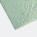
Matte lamination controls glare across a broad surface. Gloss lamination adds sheen. Soft-touch changes the tactile feel. Spot UV is a clear cured gloss placed on selected areas, so it can isolate a mark, pattern, or product name. Foil stamping uses heat and pressure to place metallic or colored foil. Embossing raises paperboard, while debossing presses it in. Put an effect in the guide only when its location and job are clear.
What should the digital proof catch before printing?
Proofing is where production mistakes are cheap to fix. Check low-resolution art, RGB files after conversion for press, bleed past trim, type too close to a score, barcode quiet space, logo clear space, panel reading order, and product-facing surfaces. If an insert is cut to the exact product size, check the actual dimensions so the product does not rattle. Review the assembled reading path, not only the flat front panel.
What should I send with a branding request?
A supplier can check a branding system only when the brief includes both brand files and package constraints.
- Send logo files, color references, type guidance, and image direction.
- Describe the product, packed dimensions, package format, and opening sequence.
- Separate fixed brand elements from product names, variants, and other changing copy.
- List the board, print method, laminate, finish, insert, window, and closure requirements.
- Share the planned quantity and delivery destination for a complete quote.
For the handoff, use custom packaging design to organize the structure and artwork brief. Custom Packaging Lane quotes from a 100-unit minimum, with pricing from $0.49 per unit at volume, quoted to spec. Production is typically 8 to 10 business days after proof approval, plus delivery. Free US shipping, free design support, and a free dieline are available. The $19.99 sample kit is credited to the first order.
Frequently Asked Questions
What is custom packaging branding?
Custom packaging branding is a repeatable set of rules for logo placement, product-name hierarchy, typography, color roles, imagery, panel order, and surface treatment. It also records what changes when a carton becomes a tin, mailer, sleeve, or rigid box. The result is a related package family with room for different dimensions and openings.
How do colors behave on different packaging stocks?
Colors can shift when the substrate changes. Coated paperboard gives a smoother printed surface, while kraft board keeps more of its natural tone. Wrapped rigid board and corrugated surfaces add their own texture. Set color roles, review ink coverage on the proof, and keep contrast strong around product names and required copy.
Can one finish work across every branded package?
One finish does not have to cover every format. Matte or gloss lamination can set the broad surface direction, while soft-touch, spot UV, foil stamping, embossing, or debossing can mark a selected area. The guide should state where each effect belongs and when a plain panel is the better choice.
How should a brand system adapt to a new box structure?
Map the fixed elements onto the new dieline, then recheck panel order, folds, seams, glue tabs, closures, and usable logo space. Straight tuck end, reverse tuck end, sleeve, drawer, and two-piece rigid formats do not present the same reading path. Keep the rule consistent, not the panel geometry.
What does a printer check in packaging artwork?
A printer checks trim, bleed, score placement, glue zones, type size, barcode quiet space, image resolution, and the assembled reading order. RGB art can shift when converted for press, and type too close to a score can become hard to read. The digital proof is the place to catch those issues before printing.