














































RGB is a screen color model built from red, green, and blue light. CMYK is a print color model built from cyan, magenta, yellow, and black ink. A color shift is a visible change between the screen version and the printed version. A digital proof is the package artwork version sent for approval before printing. For packaging, the practical task is to protect the colors that carry recognition, product separation, or readable contrast.
Which Illustrator colors should I flag before converting to CMYK?
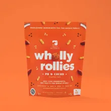
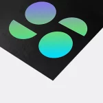
Flag saturated greens, cyans, electric blues, purples, neon oranges, vivid yellows, dark fields, gradients, and photographs first. These areas can lose brightness, move warmer or cooler, or show a heavier transition after conversion. The change is not automatically a defect. It is a reason to inspect the color beside the logo, product name, and other printed elements that give the package its job.
| Artwork area | Common change | What to check |
|---|---|---|
| Saturated green or cyan | Lower brightness or changed channel balance | Logo separation from the panel |
| Electric blue or purple | Darker or less intense appearance | Product distinction at package size |
| Neon orange or vivid yellow | Warmer or less luminous appearance | Front-panel visual priority |
| Dark background | Different density and contrast | Small type and fine rules |
| Gradient or photograph | Changed highlights, shadows, or transitions | Image detail and smooth blending |
What does a color shift look like on a package panel?
A color shift can show up as lost contrast, a darker background, a product shade that moves closer to its neighbor, or a gradient that feels heavier at one end. The eye judges the color beside other colors, so inspect the whole panel instead of a single swatch.
Large solid fields expose a change faster than a small accent. White board, kraft board, black panels, printed photographs, and glossy or matte surfaces also alter how reflected color is seen. Mark the panel and the nearby element in the color note. A vague request to make the file brighter gives the next person no usable target.
How do I keep repeated brand colors consistent?
Keep repeated brand colors in named shared swatches, then inspect the converted swatches wherever they appear. A shared swatch gives the art team one controlled place to adjust a color instead of chasing separate objects across several package versions.
Leave the original RGB file untouched and prepare a separate CMYK working copy. If the same logo appears on white and kraft surfaces, check both locations. A color can look balanced on one panel and lose contrast on another because the surrounding surface changes the visual relationship.
Which Illustrator file settings matter before a proof?
Work from a duplicate file, set the print copy to CMYK, check linked images, and check gradients, transparency, and small reversed type. Changing the document mode does not remove the need to inspect placed artwork and effects.
Keep the package construction in the file check. A dieline is the flat cutting template that shows panels, scores, cuts, and glue tabs. The standard prepress check is to extend bleed past the cut line, keep type away from a score, and make sure a dark field does not hide small copy near a fold. These checks keep a color decision tied to the object being printed.
When should a digital proof decide between two colors?
Use the digital proof when two converted colors are both workable but one better protects recognition, contrast, or product separation. CPL sends a digital proof before printing, so compare the logo, product name, background field, and side panels on the actual layout rather than debating screen values in isolation.
Record the selected color and the reason for it with the approved artwork. If the package uses a tinted surface or a finish that changes reflection, note that context in the proof check. The $19.99 sample kit can give you a physical surface reference before approval.
Which packaging products are useful color references?
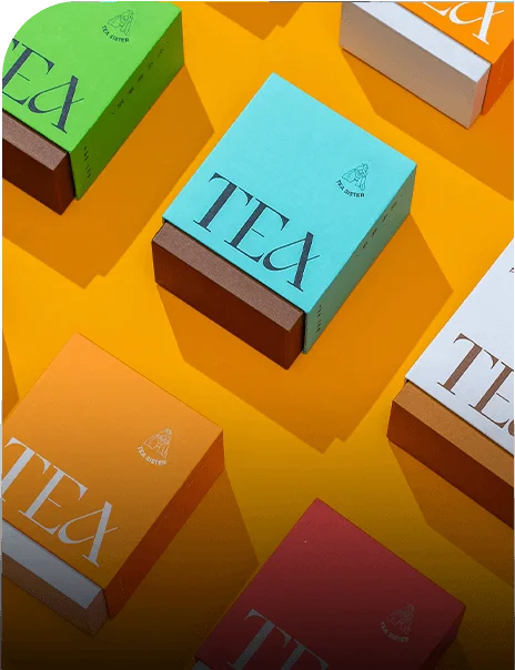
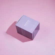
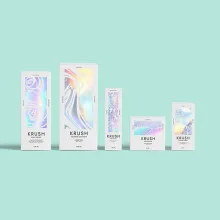
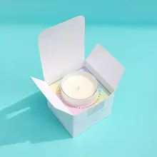
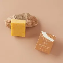
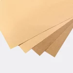
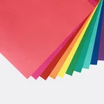
Use one-piece color-tinted kraft tuck-top gift boxes as a reference when the surface color is part of the visual decision. Hair color boxes are a practical reference when product shades, names, and repeated brand colors must stay distinct. A second look at the hair color box format helps compare related color families in one package system.
What should I send with a color-sensitive packaging file?
Send the original RGB source, the CMYK working copy, the dieline, linked images, and a short note naming the colors that cannot drift much. Include dark fields, gradients, photographs, small reversed type, and product shades that separate one item from another. CPL's custom packaging design support includes free design support for organizing the file and proof questions.
The MOQ is 100 units. Pricing is from $0.49 per unit at volume, quoted to spec. Production is typically 8 to 10 business days after proof approval, plus delivery. Free US shipping is available. Send the artwork for checking with the color priorities marked.
Frequently Asked Questions
Can Illustrator preserve every RGB color in CMYK packaging print?
Illustrator cannot preserve every RGB screen color exactly in CMYK packaging print because screens emit light and printed ink reflects it. A separate CMYK working file, named swatches, and a digital proof help you protect the colors that carry logo recognition, product separation, and readable contrast on the package.
Why do green, blue, and neon colors change after conversion?
Green, blue, and neon colors often change after RGB to CMYK conversion because the screen can display brighter colors than process ink can reproduce. The printed result may look darker, warmer, or less intense. Check each color beside the logo, product copy, and package surface instead of judging the swatch alone.
Should I convert the original Illustrator file?
Do not convert the only Illustrator source. Save the original RGB file, duplicate it for CMYK preparation, and keep the source available for digital artwork or later revisions. A separate working copy makes it clear which file went through conversion and keeps the color decision reversible while the proof is in discussion.
What should I compare in a packaging proof?
Compare the logo, product name, dominant background, product variant colors, small reversed type, and gradients in the digital proof. Judge each color beside the elements it must support. Record the selected version and the reason for the choice, especially when the package uses kraft, white board, matte, or gloss.
What are CPL's MOQ, price, and timing?
CPL's MOQ is 100 units. Pricing is from $0.49 per unit at volume, quoted to spec. Production is typically 8 to 10 business days after proof approval, plus delivery. Free US shipping and free design support are available, and the sample kit is $19.99 for checking physical packaging surfaces before approval.