



























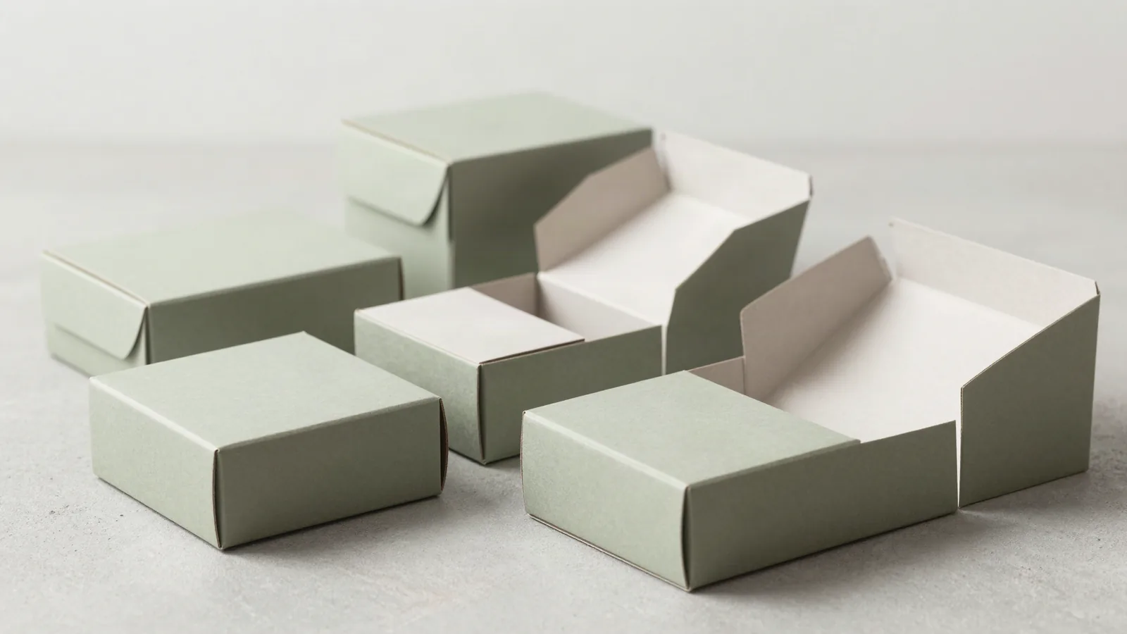















































Packaging comps are side-by-side mockups used to compare a package before a final specification is approved. A comp can show the outside shape, panel order, artwork, board, print method, finish, opening, and insert direction in one place. It cannot prove physical fit unless the structure is built. Start with the product and its dimensions, then use the comp to record what changes between options. That gives the quote and proof a real decision to follow.
What are packaging comps used for?
The useful output is a decision record, not a polished picture. Each concept should state the structure, inside fit, opening path, board or substrate, artwork coverage, finish zones, and the question it is meant to settle. Keep the same product and evaluation rules across the set.
| Comp format | What it shows | Next physical check |
|---|---|---|
| Digital visual comp | Artwork hierarchy, panel order, color direction, finish intent | Confirm fit, folds, and closure |
| White structural comp | Shape, opening, folds, closure, product placement | Check board behavior and final color |
| Printed artwork comp | Panel layout, copy placement, logo scale, surface direction | Confirm production variables and handling |
| Side-by-side format set | Differences between carton, sleeve, mailer, rigid, and drawer | Apply the same decision criteria |
Which structural details should a comp show?
A dieline is the flat cutting template that a printer prints and cuts to make the package. The comp should identify whether the carton uses a straight tuck end, reverse tuck end, auto-lock bottom, or crash-lock base. A roll end tuck top mailer is commonly associated with FEFCO 0427. Two-piece rigid, magnetic flap, drawer or slide, sleeve, gable, and pillow formats each create a different opening path. Put the construction beside the artwork so nobody evaluates the design on the wrong shape.
Which board references should a comp compare?
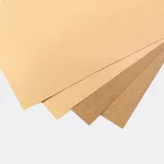
Board belongs beside the visual because caliper changes folds, score behavior, stiffness, and surface. Typical industry reference ranges for folding cartons include SBS, C1S, or C2S paperboard in the 12 to 24 pt range. Kraft board in the 18 to 24 pt range has a different surface direction. Rigid packaging commonly uses chipboard from 1.5 to 3 mm wrapped in 100 to 157 gsm art paper. Corrugated comparisons use E, B, and C flutes, with 32 ECT as a general board-strength reference. A PET window in the 0.2 to 0.3 mm range is a common reference for window patching.
How should print and finish differences appear?
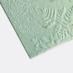
Print method and surface treatment need separate callouts on the comp. Offset CMYK suits detailed paperboard artwork, digital printing can suit a short run or artwork test, and flexo is commonly used on corrugated surfaces. Matte or gloss lamination changes reflection. Soft-touch changes the hand feel. Spot UV creates selected contrast, while foil stamping, embossing, and debossing change how a logo or pattern reads. Low-resolution art becomes soft, RGB colors can shift after conversion for press, and missing bleed leaves a hard edge at trim. A press check looks at ink coverage, registration, and the sheet against the approved proof.
Which catalog pages are useful comp references?
Catalog pages give real structures to discuss while the comp keeps the dimensions and artwork specific to the project. Wine box packaging can frame a structured presentation. Wax packaging can anchor a compact printed pack. Private label packaging keeps brand hierarchy visible, and perforated packaging raises questions about access and tear paths. These pages are reference directions, not proof that every format belongs in one order.
How do I inspect a comp before approval?
Fit comes before decoration. Place the actual product, insert, accessory, and card against the proposed inside measurements. Check panel order, closure direction, seam placement, glue areas, scores, windows, and the removal path. An insert drawn from a guessed product size can leave the item rattling. For a shipping format, record the assembled outside footprint, how many boxes nest in a master carton, and the pallet count. The package should be checked in the position in which it will be packed and opened.
What belongs in a comp comparison sheet?
- Name the format and structural convention beside each concept.
- Record inside length, width, and depth for fit review.
- Identify board, substrate, flute, laminate, or window direction.
- Mark print method, artwork coverage, and finish zones.
- List product arrangement, opening sequence, and closure behavior.
- Write the decision criteria before comparing the concepts.
How do I move from a comp to a quote?
Send the product, dimensions, intended structure, artwork status, board direction, print method, finish priorities, insert notes, quantity, and delivery location. The clock starts at proof approval, not at the first inquiry. Custom Packaging Lane quotes the approved specification from a 100-unit minimum. Pricing is from $0.49 per unit at volume, quoted to spec. Production is typically 8 to 10 business days after proof approval, plus delivery. Free US shipping and free design support are part of the request, and the free dieline records the chosen structure. The $19.99 sample kit is credited to the first order. Use custom packaging design to turn the comparison into an approved proof.
Frequently Asked Questions
Can a comp replace a physical sample?
A packaging comp cannot prove physical fit by itself. A digital comp can show artwork hierarchy, panel order, and finish direction, while a white structural comp can show folds, closure, and product placement. Use a physical sample when fit, opening force, insert clearance, board behavior, or the assembled surface will affect the decision.
What should stay the same across a comp comparison?
Keep the product, inside measurements, artwork scope, and decision criteria consistent across packaging concepts. Change one meaningful variable at a time, such as the structure, board, closure, or finish. The comparison then shows why one option works better for the packing motion or customer opening path.
Should artwork be placed on the final dieline?
Artwork should be checked against the structure-specific dieline before approval. A dieline shows cut lines, scores, folds, glue areas, and panel boundaries. Type near a score can split across a fold, and missing bleed can expose the board at trim. The flat file and assembled package should agree.
What is a white structural comp?
A white structural comp is an unprinted physical mockup used to inspect shape, folds, closure, cavity, and product placement. It is useful for catching a lid that rubs, a tab that catches, or an insert that leaves movement. It does not show final ink color, lamination reflection, or decorative effects.
What information makes a comp quote-ready?
A quote-ready packaging comp identifies the product, inside dimensions, structure, board or substrate, print method, artwork coverage, finish zones, insert, quantity, and delivery location. It also states what the comparison must prove. Those details keep the quote tied to a real construction instead of a flat image with missing folds or closures.