





































































What does RGB mean for printed packaging?
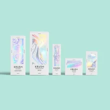
RGB is a color model built from red, green, and blue light on a screen. Printed packaging reflects ink from paperboard, kraft board, rigid wrap, or corrugated liner, so the same file can look different after conversion to a print process. Offset CMYK, the cyan, magenta, yellow, and black ink process, is common for detailed paperboard graphics. Digital printing can suit shorter runs, and flexo is common for corrugated packaging.
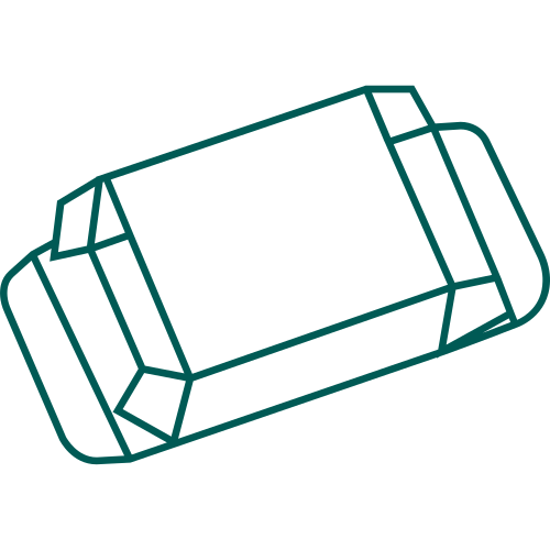
The board is part of the color decision. White coated paperboard gives a different background from kraft, and laminate changes glare after printing. A bright monitor is only a starting reference. A dieline is the flat cutting template used to print, score, and cut the package. The production file needs a digital proof that shows the panels, folds, bleeds, windows, and finish notes together.
Which board should I plan around when converting RGB?
Typical stock ranges give the conversion a physical surface to account for: SBS, C1S, or C2S paperboard is commonly 12 to 24 pt, kraft board is commonly 18 to 24 pt, and rigid chipboard is commonly 1.5 to 3 mm wrapped in 100 to 157 gsm art paper. Corrugated packaging is commonly specified as E, B, or C flute, with 32 ECT as a common reference. PET windows are commonly 0.2 to 0.3 mm.
| Substrate or format | Typical industry reference | Color check |
|---|---|---|
| SBS, C1S, or C2S paperboard | 12 to 24 pt | Check contrast, fine type, and laminate glare. |
| Kraft board | 18 to 24 pt | Check light colors against the natural board tone. |
| Rigid chipboard wrap | 1.5 to 3 mm chipboard, 100 to 157 gsm art paper | Check the printed wrap across every visible panel. |
| Corrugated board | E, B, or C flute, 32 ECT common reference | Check gradients and small type across scores. |
| PET window | 0.2 to 0.3 mm | Keep the important image outside the clear patch. |
E-flute has a finer profile and usually gives a smoother print surface than B-flute. B-flute adds board depth and cushioning. C-flute is thicker and is often discussed for shipping and stacking. Those are material tradeoffs, not a promise that one flute fits every carton.
How should I convert and proof RGB artwork?
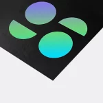
The production profile determines the conversion. RGB artwork needs conversion for the selected print process, then a check of the areas that changed visibly. RGB colors can shift when converted to CMYK, especially bright greens, blues, and saturated oranges. Open the file at final panel size, since a small label that looks clear on a monitor may fail once it sits beside a score or glue tab.
- Check the converted colors against the selected board or liner.
- Inspect gradients, dark fields, thin rules, logos, and small type at final scale.
- Mark panels, folds, bleeds, glue areas, lock tabs, inserts, and windows on the proof.
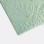
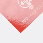
- Keep foil, spot UV, embossing, and debossing as separate finish instructions.
- Compare the assembled sample with the same approved artwork version.
A common packaging convention leaves about 1/16 in, or 1.5 mm, as a planning tolerance, subject to the material and structure. Keep type and critical art clear of that risk area. Bleed belongs beyond the cut line, not at the cut line. Matte or gloss lamination changes glare, soft-touch changes hand feel, and spot UV, foil stamping, embossing, and debossing need separate placement notes.
Which package structures make RGB color easier to control?
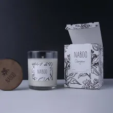
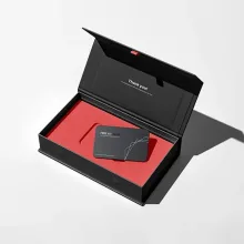
Panel count is the practical question. A straight tuck end or reverse tuck end carton gives separate front, side, top, and back panels. An auto-lock or crash-lock base changes the lower panel, so critical copy should not sit where the closure folds. A sleeve keeps the main graphic on an outer wrap. A drawer, magnetic flap, or two-piece rigid structure creates separate surfaces that need their own color checks.
Use a real catalog shape when you brief the artwork: wine box packaging gives a tall panel example, wax packaging shows a compact printed surface, towel packaging gives a broader fold layout, and perforated packaging adds a tear path that must stay clear of important color blocks. Custom boxes with logo is the relevant hub for branded structure planning.
What should I send for an RGB packaging check?
A useful check includes the original RGB artwork, color references, product dimensions, assembled length x width x depth, board or laminate direction, print process, coverage, finish, and any window or insert notes. Identify which panels must match closely. If the package touches a consumable, ask us about food-contact options for your product.
Custom Packaging Lane quotes to spec from a 100-unit minimum. Pricing is from $0.49 per unit at volume, quoted to spec. Production is typically 8 to 10 business days after proof approval, plus delivery. Free US shipping, free design support, a free dieline, and a $19.99 sample kit credited to the first order are available. Order the sample kit to compare board and finish choices before approving the proof.
Frequently Asked Questions
Can RGB artwork be used for packaging?
RGB artwork can start a packaging project, but the file needs conversion for the selected print process before production. Keep the original RGB references, then check the converted file against the chosen board, finish, dieline, and final panel size. A digital proof should show folds, bleeds, windows, glue areas, and finish instructions so color intent is reviewed with the package structure.
Why does RGB color change on a printed box?
RGB color comes from light on a screen, while a printed box reflects ink from a physical substrate. Board tone, ink coverage, print process, laminate, and viewing light change the result. Kraft board can affect light colors, coated paperboard changes contrast and glare, and corrugated scores interrupt gradients. Check the converted artwork on the selected substrate before approval.
Which print process fits RGB packaging artwork?
Offset CMYK is commonly used for detailed paperboard graphics, digital printing can suit shorter runs, and flexo is common for corrugated packaging. The print process affects gradients, fine details, small type, and color conversion. Compare the artwork with the board, package structure, quantity, and finish instead of judging the file from a monitor screenshot alone.
How should foil and spot UV appear in an RGB file?
Foil stamping, spot UV, embossing, and debossing should appear as separate finish instructions rather than as color hidden inside a flattened RGB image. Mark each effect on the dieline and keep it away from folds, windows, glue tabs, and cut paths. Matte or gloss lamination also changes glare, so the finish belongs in the proof review.
What belongs in an RGB packaging proof?
An RGB packaging proof should include the converted artwork, panel labels, folds, bleeds, glue areas, windows, inserts, and finish notes. The proof should be checked at actual panel size for gradients, dark fields, logos, thin rules, and small type. Compare the approved file with an assembled sample when possible because a flat screen cannot show every structural change.